
Milan’s Pizza
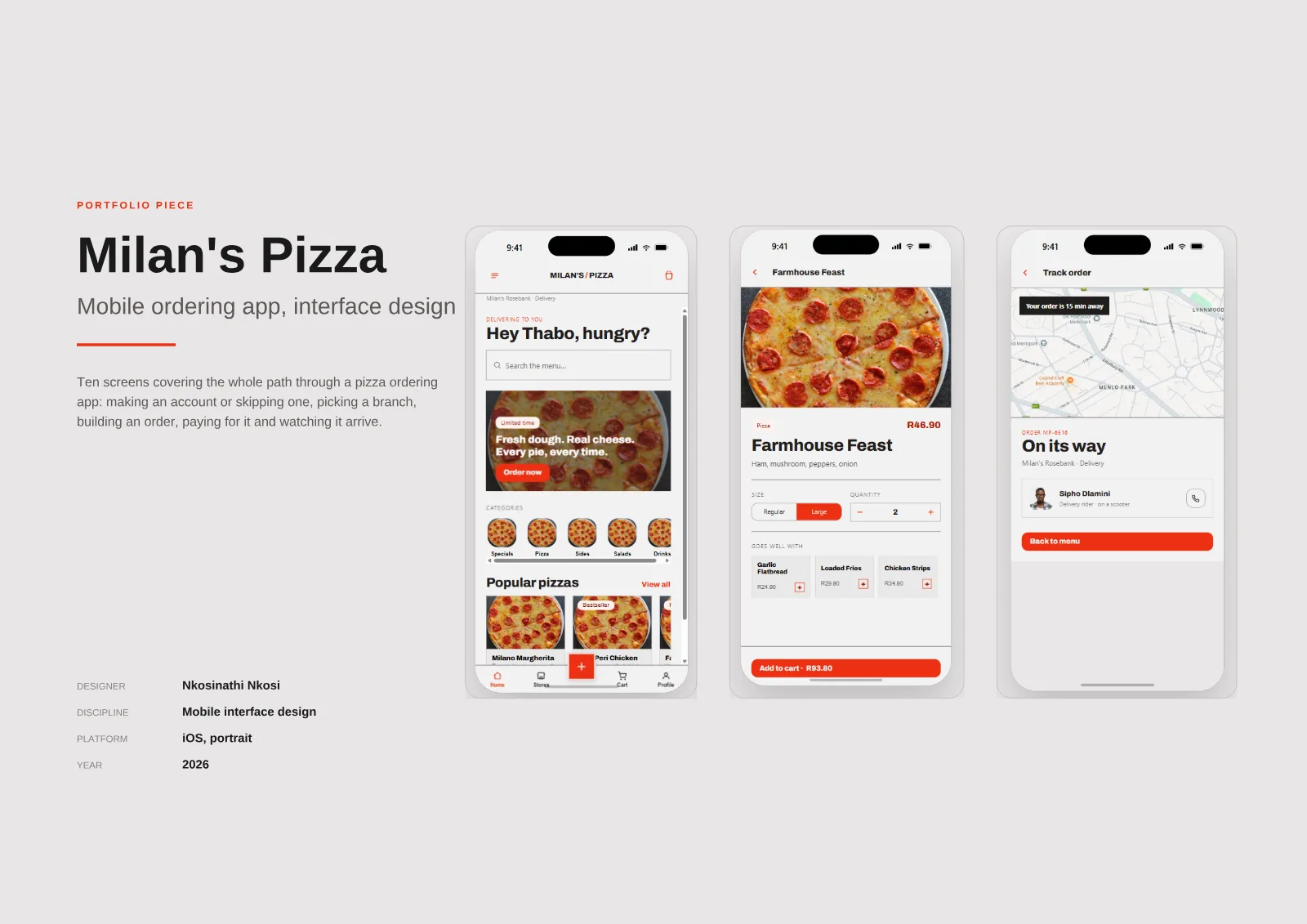
Ten screens covering the whole path through a pizza ordering app: making an account or skipping one, picking a branch, building an order, paying for it and watching it arrive. The brand is fictional, so this is a concept rather than a commissioned redesign.
- Discipline
- Mobile interface design
- Platform
- iOS, portrait
- Market
- South Africa: rand pricing, delivery and collection
- Status
- Concept design, not built
The brief
01 · Problem
A food-ordering journey must keep the selected branch, delivery method and running total clear while a customer builds and tracks an order.
02 · Work delivered
A ten-screen iOS interface concept covering the complete path from opening the app to live order tracking.
03 · Outcome
A documented product-design direction demonstrating a coherent end-to-end ordering experience. This is a fictional concept, not a commissioned redesign.
What makes it work.
- 01
The total travels with the button
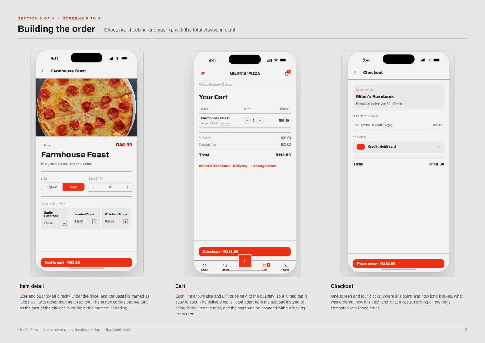
The running total sits on the primary button from Add to cart through Checkout to Place order, so the price is never a surprise.
- 02
The kitchen is always named
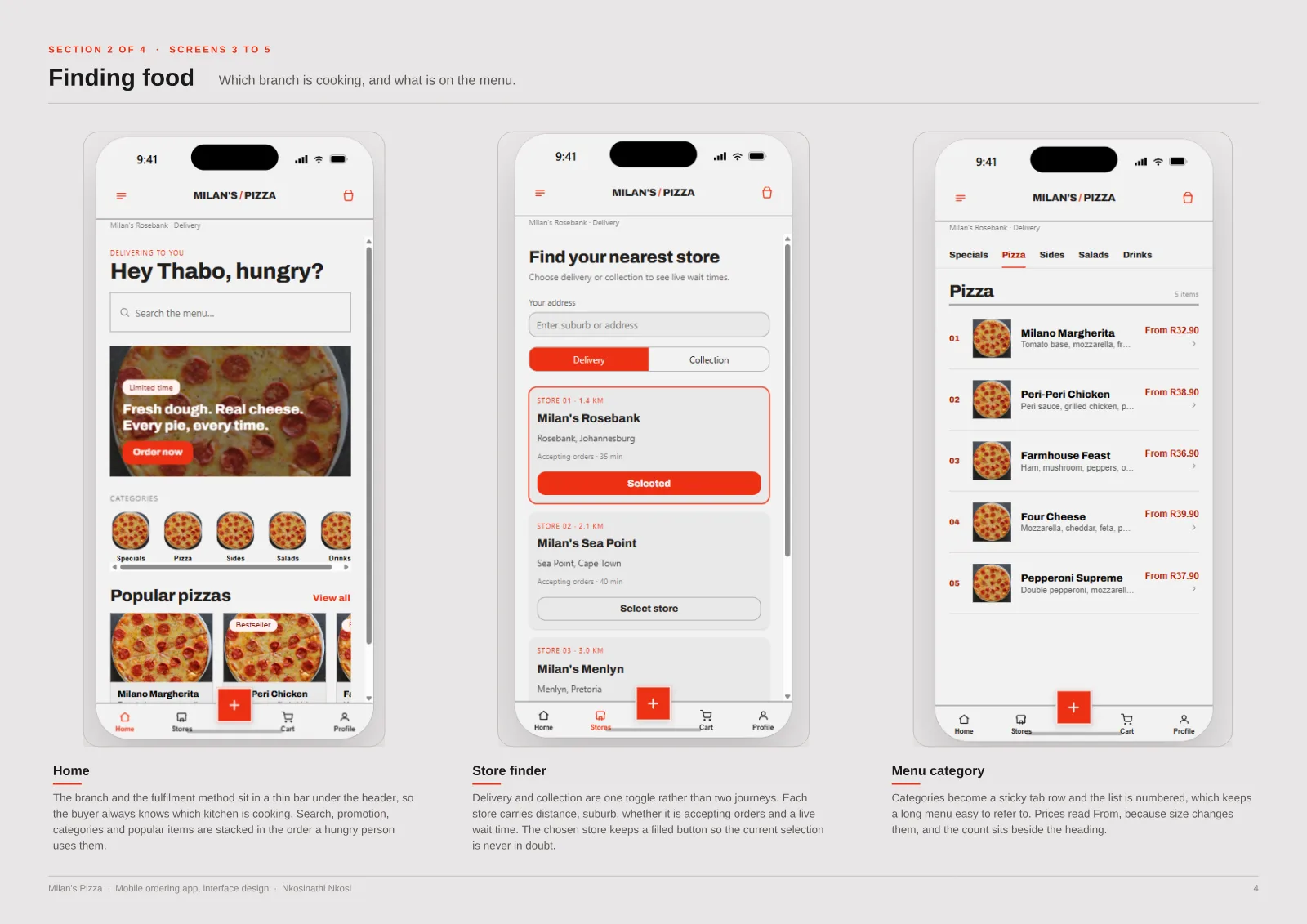
The branch and delivery method stay pinned under the header, because a wrong store means a wrong wait time.
- 03
Red only moves the order forward
One colour is reserved for the action that advances the order. Everything else stays neutral.
- 04
No account wall
Guest checkout sits next to log in, and an account is offered for tracking and reordering instead.
Case study document
-
Milan’s Pizza: app design