
E-commerce UX case study
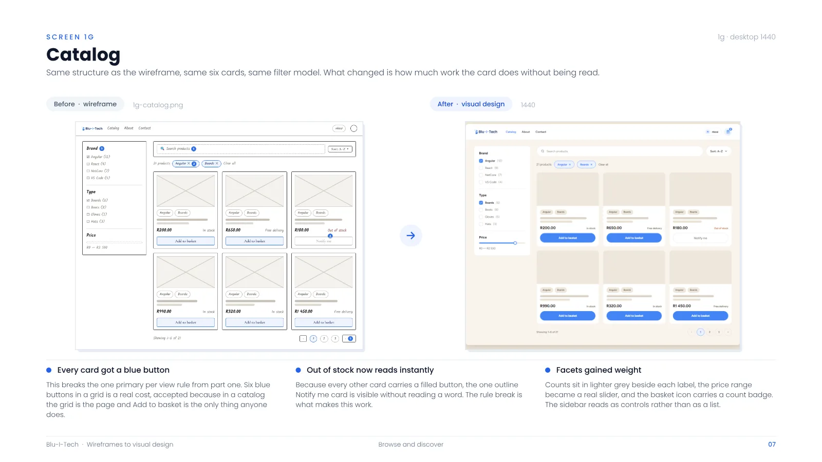
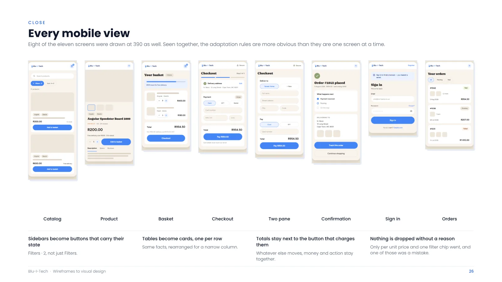
A two-part case study for an online store selling developer-branded gear in South Africa. Part one wireframes the full purchase path, including the loading, failure and admin states that usually get drawn last. Part two carries eleven of those screens to finished visual design, with mobile views for eight.
- Discipline
- UX and visual design
- Scope
- 17 screens, 5 flows, 4 user areas
- Platforms
- Desktop and mobile
- Payments
- Stripe, rand pricing, 15% VAT
The brief
01 · Problem
E-commerce design often leaves loading, failure, payment and administration states until late, creating gaps in the real purchase journey.
02 · Work delivered
Seventeen screens across five flows and four user areas, followed by finished visual designs and eight mobile views.
03 · Outcome
A documented UX and visual-design system that compares checkout approaches and treats payment failure and processing states as first-class screens.
What makes it work.
- 01
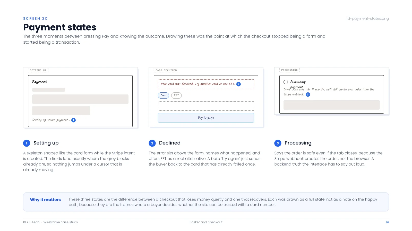
Failure drawn as first-class screens
Declined cards, processing and setup states, skeletons and error pages were designed in full, which turned nine screens into seventeen.
- 02
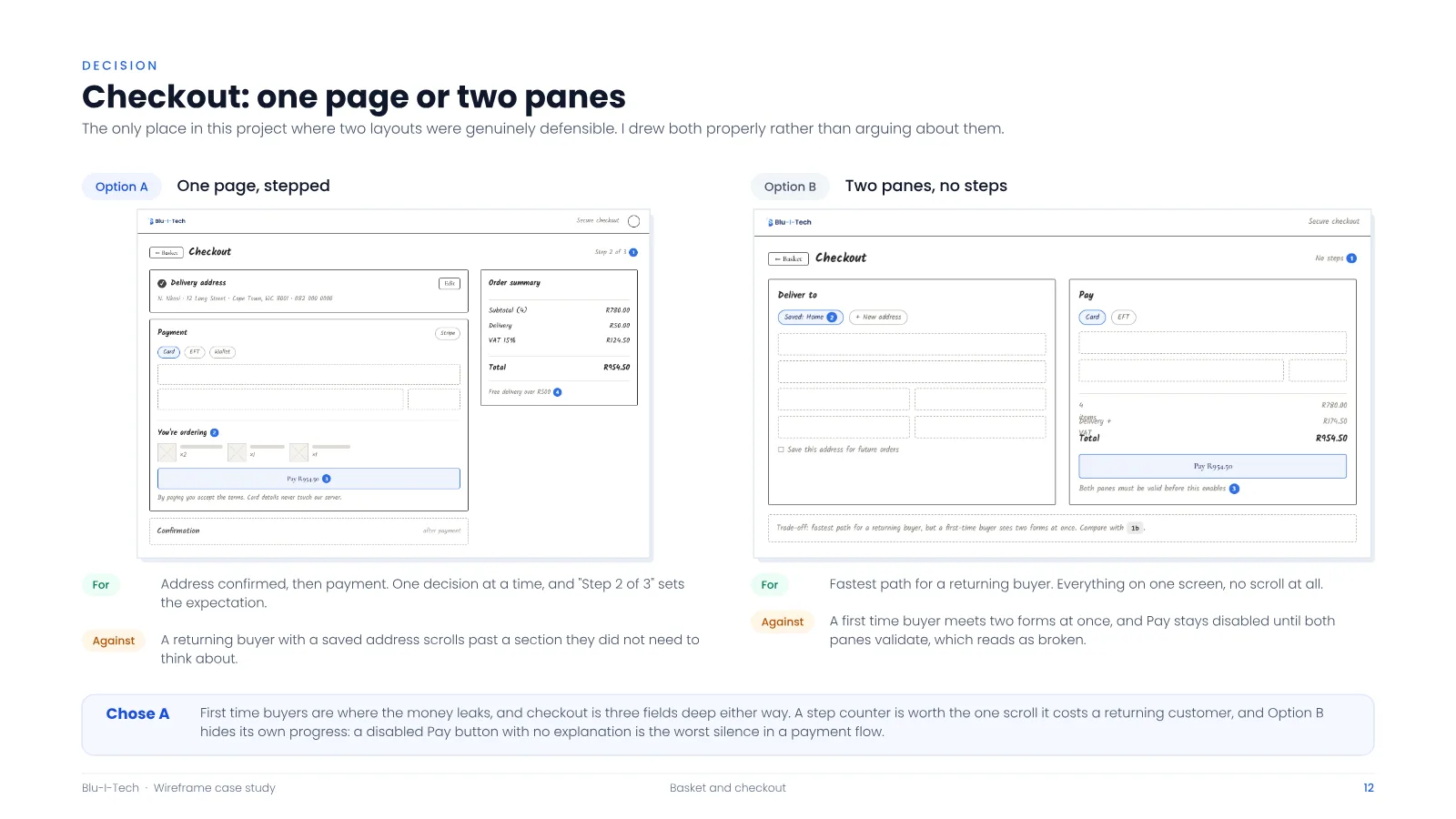
Two checkouts drawn, one chosen
A stepped one-page checkout and a two-pane layout were both drawn to finish. The stepped version won, because first-time buyers are where money leaks.
- 03
Buttons say the number
“Pay R954.50”, not “Submit”. The amount on the button always matches the order summary.
- 04
Nine parts, seventeen screens
Every screen is built from the same nine components, so the set reads as one system rather than a pile of drawings.
Case study documents
-
Part one: wireframes
-
Part two: wireframes to visual design